My First Application
At the beginning of my journey of learning User-Centred Design I decided to attend the ‘UX Design’ course at the University of the Arts London (UAL), where I went through the following stages in order to create my first prototype of a mobile application:
- User Interviews
- Personas Creation
- Storytelling
- Sketching
- Prototyping
- Usability Testing
Persona
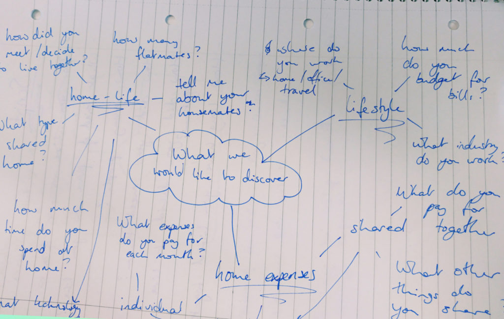
Based on what I (together with the team members) found out during the interviews about users’ demographic background, needs and challenges this persona was crated:
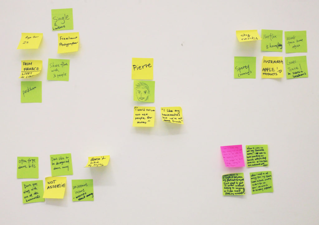
Demographic information: Pierre is a 27-years old Photographer and Freelancer. He rents a small flat in London (Peckham) with 3 other people whom he shares the bills with.
Behavioural information: He watches Netflix every day, likes sport, as well as Instagram and Apple products; Pierre works from home and doesn’t socialize much (single).
Challenges and frustrations: Pierre is not assertive, often forgets to pay bills and doesn’t get along with one of his flatmates.
Needs and goals: better organisation of finances in Pierre’s flat, e.g. reminders sent to flatmates, options for chasing others to pay.
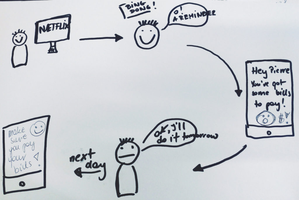
Storytelling
Knowing our Persona needs and frustrations I created user stories in order to solve the problem (after identifying it). Here is an example of the user story:
As a Flatmate, I need to remember about the payments in my household so that I know when and whom I should pay.
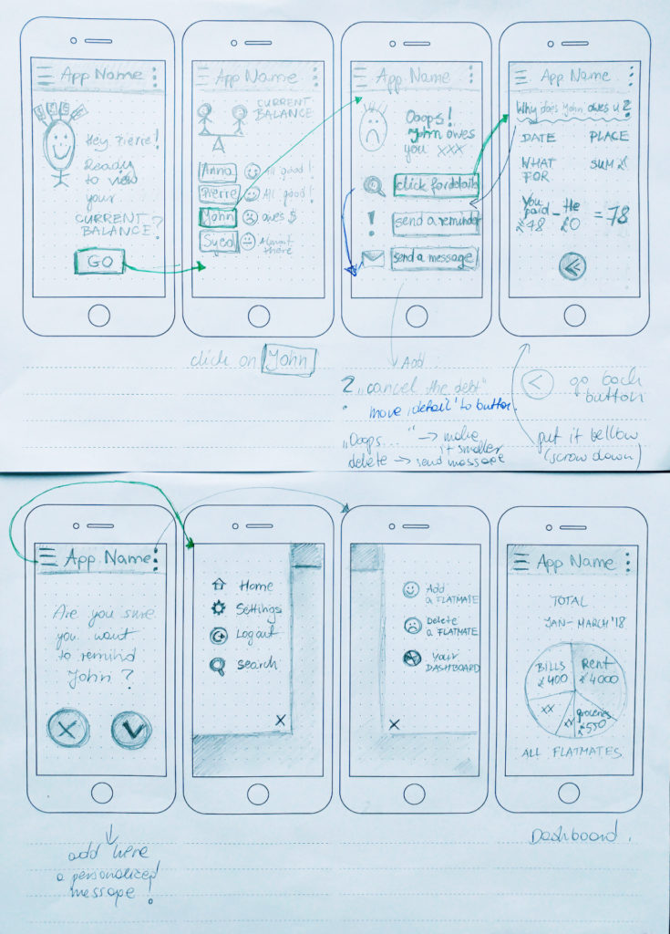
Sketching and Prototyping
The next step included sketching some ideas and discussing them with the team members.
The generic application’s GOAL was to support the flatmates in managing finances in their household.
Here are the examples of my first sketching examples:
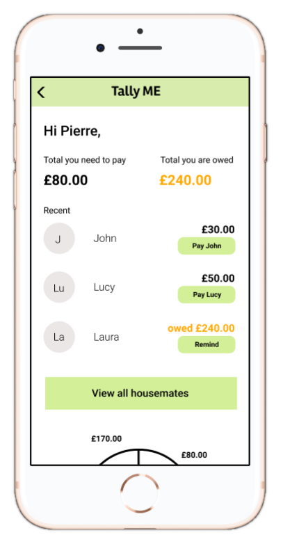
‘Tally Me‘. First Prototype
On the left you can see the prototype I created in Figma together with other students during the class at the University of the Arts London.
Click on the picture to see and test the prototype.
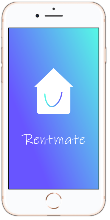
‘Rentmate’. Second Prototype
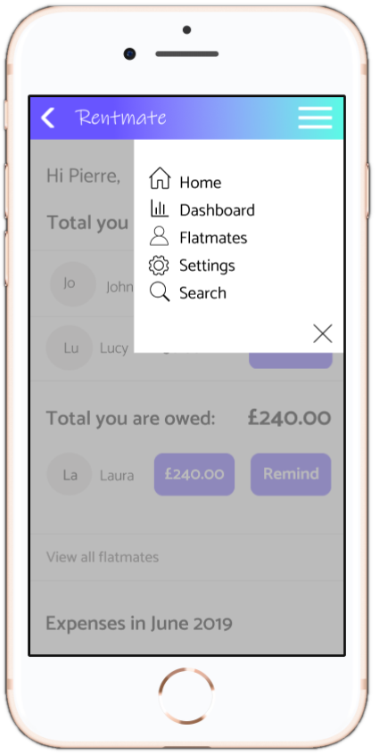
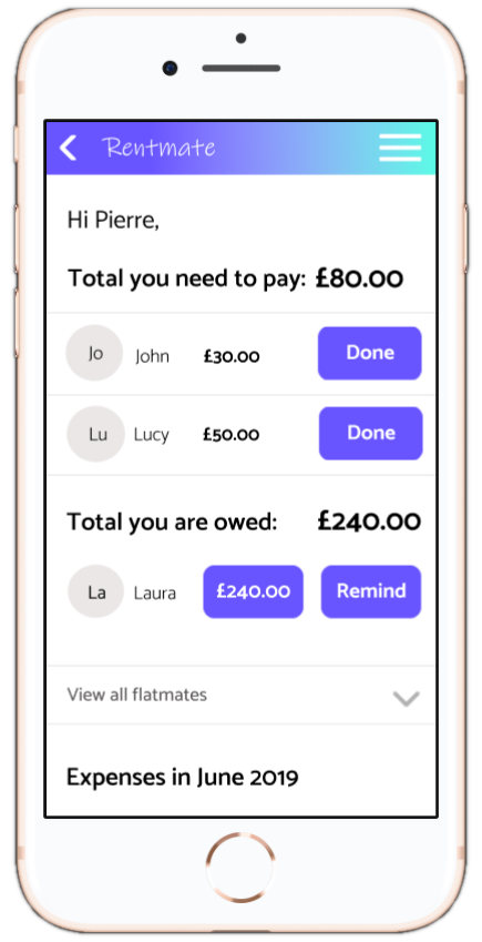
Having conducted usability testing (seven users), I decided to apply the following changes to my mobile application prototype (see the images below):
- The new name of the application: RENTMATE as the users did prefer this one
- A few improvements of layout and visual hierarchy, such as moving the buttons around (e.g. ‘Remind’), separating the section ‘total you need to pay’ from ‘total you are owed’ and changing the font size of most crucial numbers (e.g. money owed) and some important words (as the users suggested)
- Adding a hamburger button to the top bar with a drop-down menu
- A different wording to make the app user-friendly, e.g. ‘Nice one, you have sent a reminder!’