About the Company
In October 2019 I got involved in a huge project for an American media and tech conglomerate. The company was divided into five divisions hiring about 84 000 employees and my responsibility was to collect feedback from all five branches and translate their requirements into wireframes, mock-ups, user flows and user stories. During seven months of this collaboration, I established a strong partnership with the business representatives (thanks to frequent, intensive and effective calls with all the departments).

About the Project – ITSM Portal Development
| Product, Goal | IT Service Management Platform Customization and harmonization of the processes |
| Timeline | July 2019 – April 2020, my involvement: October 2019 – April 2020. |
| Team | Seven streams (e.g. Testers, UX / UI Team, Developers, Knowledge Base Team), based in Poland, India and North America |
| UX / UI Team | Two UX Managers (including me) and one Project Manager |
| Methodology | Agile Software Development (Scrum) |
| My role | UX Manager, Business Analyst, UX Researcher, UX Designer |
During the project I was responsible for conducting the following UX Research and UX Design activities:
- Organising Card Sorting and Usability Testing sessions and analysing the results from these studies as well as coming up with recommendations
- Creating Wireframes (Figma) – a constant process of discussing the mockups with the business representatives, redesigning and testing the new prototypes
- Collaboration with developers based in India, Poland and North America
- Cooperation with representatives from the five divisions
- Creating stories and manual testing, Smoke Testing, User Acceptance Testing elements
About the Users
I was designing for employees of the company living in North America, working in different positions in the media and tech sectors. After the User Interviews, Surveys and Workshops with stakeholders had been conducted three Personas were created. In the table below, you can see listed four top recognized pain points.
| Top Pain Points |
|---|
| 1. Multiple systems to manage manually and no integration between them |
| 2. Confusing way of presenting a ticket – hard to understand at a glance |
| 3. Not intuitive and outdated design of interfaces |
| 4. Lack of ticket traceability – what status my ticket has in the context of the full process |
Design Process
My team worked in agile methodology (scrum – sprint-based project management) and followed the best practices of the user-centred design and service design approach. In order to describe the Design Process of this ITSM portal, I divided it into three stages and demonstrated in the illustration.
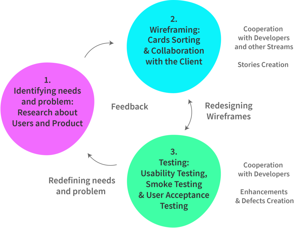
Stage 1 – Users Needs
The goal for this stage was to identify users needs and problem. This phase included the following UX Research activities: User Interviews, Workshops with the stakeholders, User Surveys, Personas creation which helped us to understand the employees’ goals, frustrations and needs, as well as to identify the main pain points.
Stage 2 – Wireframes
The main objective was to come up with some ideas, wireframes of the user-friendly platform based on the client’s current IT Portal and on the information collected in stage 1. In order to create the first mockups, we built the Information Architecture document with the structural design of information we wanted to include.
Also, we conducted Card Sorting and Usability Testing studies and took part in frequent sessions with the client in order to discuss the current mockups and gain their feedback as well as to redefine their needs and the wireframes if necessary.
Stage 3 – Testing
This stage includes Usability Testing sessions, Smoke Testing, Manual Testing and Usability Acceptance Testing (UAT) in which the divisions’ representatives, UX / UI Team, Testers and the End Users were involved. During the testing, issues and defects were identified and we (UX / UI Team) had to redesign our mockups in Figma in order to resolve these defects and discuss the changes with the developers and get the approval from the client.
UX Research / Design Activities
I joined the team in October 2019, therefore the Personas, User Interviews, Surveys and Workshops with stakeholders were already conducted and the main users’ and client needs/goals identified, as well as the pain points.
Our UX / UI team main goal was to create a user-friendly ITSM platform by combining the knowledge of existing tool and the software of our partners as well as the information collected during the stage of identifying user needs and problem.
UX Research and UX Design Techniques:

- Remote Usability Testing
- Card Sorting x 2
- Wireframing in Figma
Card Sorting
We used the Card Sorting technique (twice) in order to organise two subpages of the portal. Here is the summary from one of Card Sorting study.
| Participants | 54 invited, 29 took part, 24 performed the whole task; Employees from five divisions |
| Methodology | Approach: open card sort (participants create the labels for the categories themselves) Used tool: Proven By Users – online card-sorting software |
| Timeline | 13 – 20 December 2019 Duration of the sessions: 15 – 60 minutes, online, remote |
| Goal | To organise 62 cards into groups and name these categories |
Results – Dendrogram and Clusters
The results of the research were presented in a dendrogram. Dendrograms are used to illustrate the arrangement of the clusters produced by ‘average link cluster analysis’
The average link cluster algorithm finds a set of cards (two or more) with the highest similarity score / percentage. On the picture below you can see a part of the dendrogram that I analysed during the study with an example of the cluster (group / category) marked with green colour.
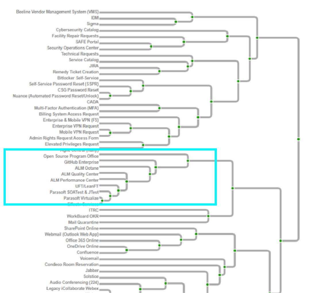
Thanks to the participants’ choices on categorizing 62 cards I managed to identify 10 groups. In the next section, you can see the wireframe I built using the above categorization.
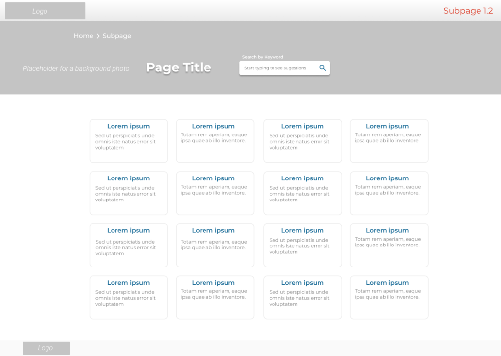
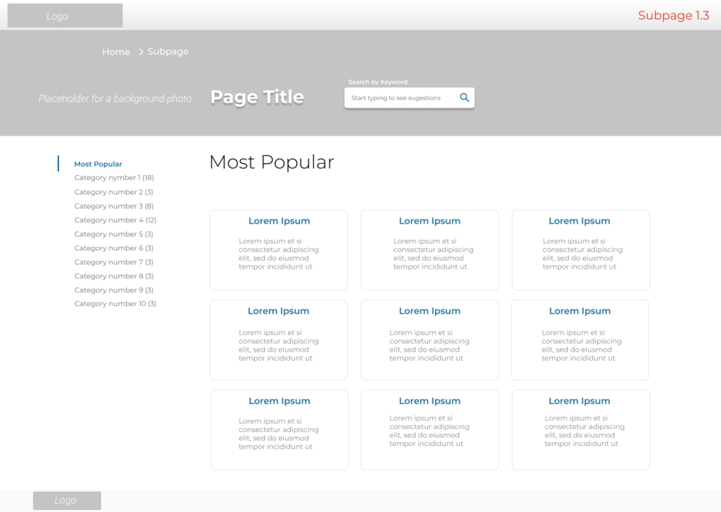
Wireframes Based on Card Sorting Results
Below you can see an example of two wireframes: 1. Designed before the Card Sorting sessions with 62 items displayed on one page (main content area); the tiles are not organised and not categorized; 2. Created after the study, with 62 items grouped and organised. 10 categories of the items are displayed on the left-hand sidebar.
Before Card Sorting (image below)
After Card Sorting (image below)
Usability Testing – Think Aloud Protocol
We conducted remote Usability Testing 1-hour-long sessions (via videoconference) with 9 employees from different divisions.
The users were asked to think aloud as they were performing the tasks – to say whatever they were looking at, thinking, doing, and feeling at each moment. They were given nine scenarios and here is an example of one:
‘The last mobile phone you had is broken and can’t be repaired. You want to order a new one. Order a new phone using ITSM Portal’
| Usability Testing Goals |
|---|
| 1. Gain users’ feedback about the platform |
| 2. Measure user experience (see the definition of usability below the table) |
| To measure usability the following metrics were used: Effectiveness – task success measurement, success rate (0, 0.5 or 1) Efficiency – number of viewed pages (measured in comparison to experts’ results; usage of non-parametrical statistical tests) System Usability Scale (SUS) Questionnaire |
| 3. Identify usability problems – elements that should be changed based on users feedback |
Usability is ‘the extent to which a product can be used by specified users to achieve specified goals with effectiveness, efficiency and satisfaction in a specified context of use.’
(The official ISO 9241-11 definition of usability)
Issues and Recommendations
During the usability testing, we have observed 3 main issues and recommended solutions which we implemented in the wireframes, discussed with the client and the developers, and, in the end, managed to create a better, more user-friendly platform. Here is a table with a summary of the main usability problems and our recommendations.
| Usability Problems | Recommendations |
|---|---|
| 1. Users weren’t sure what happens with the items added to their ‘shopping cart’ when leaving the site | #1. Adding notification in My Cart: ‘These items will remain in your cart, even if you leave this site’ |
| 2. Confusion when looking for a specific form | #2. Changing the order of the categories and adding additional sentence explaining where to find a specific form |
| 3. ‘Cancel’ button on the dialogue window was confusing. Instead of clicking OK to cancel an order user hit ‘Cancel’ and cancelled the whole action. | #3. The questions users were answering: ‘Are you sure you want to cancel this order? Our recommendation was to change the button label from ‘Cancel’ to ‘No’ |
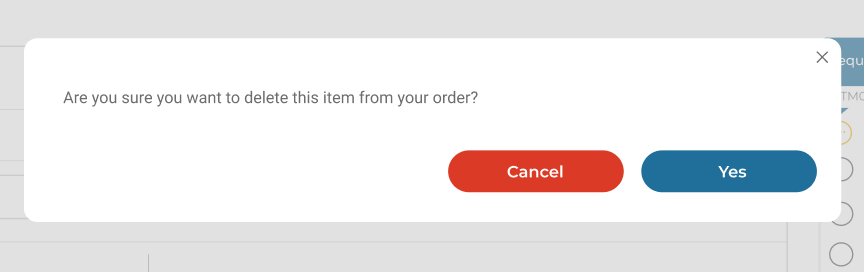
Example of the implemented recommendation
On the screenshot below you can see a captured situation before the Usability Testing sessions. During the study, we observed that the label of the red button: ‘Cancel’ was confusing for users, they weren’t sure whether by clicking on it they would cancel the order or the dialogue window.
Before Usability Testing (image below)
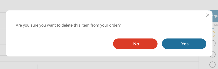
After the usability testing sessions, we changed the confusing label of the red button from: ‘Cancel’ to ‘No’. See the screenshot below.
After Usability Testing (image below)
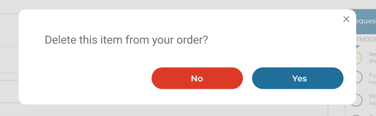
I would recommend slightly different questions for the confirmation dialogue e.g. ‘Delete this item from your order?’, to make them:
- Shorter and simpler, therefore, less time consuming
- Less confusing – the part ‘Are you sure’ is an additional and unnecessary layer which might create confusion.
My recommendation (image below)
Conclusions and Results
Here is a short summary of the main tangible results of my work:
- Findings from the Card Sorting sessions and Usability Testing studies were reflected in the mockups of the IT Portal which became more user-friendly
- We (UX / UI Team) created wireframes of the IT Portal, discussed them with the client, tested and redesigned when it was necessary
- I collaborated with the developers, instructed them on the user flows and created stories, defects, enhancements in our development tool
- Lesson learnt: communication within the team is crucial especially when working on international projects like this one